Canadian researchers Aaron van Donkelaar and Randall Martin at Dalhousie University have created a map which shows the air pollution around the world…
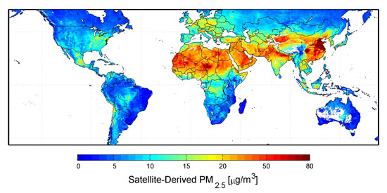
Published via NASA, the map takes into account the density of fine particulate matter – particles that are 2.5 micrometers or less in diameter – which can get past the body’s normal defences and penetrate deep into the lungs.
China’s unsurprisingly looks the most hazardous of all. The map does count in natural particles such as the desert dust, which obviously clouded the Sahara and Middle East, and also contributing to China’s yellow dust storm each year.
But it’s probably an undeniable fact that China’s factories, which the the small-medium industries which are based on primitive technology, are producing large amount of airborne pollutions over the past two decades. And it seems that the situation is getting worse from a recent official environmental report.
